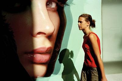
 Constantine Manos, Girl on Ermou Street, Athens, Greece, September 2003
Don't miss the splendid "slide show" of Costa Manos's American Color at Magnum in motion. Leave your sound on (but, for those at work, it does have sound). And when you're done, click on the "Leica M8" link.
Highly enjoyable, highly recommended—come back to this later if you don't have time now. There is also a book
Posted by: MIKE JOHNSTON, thanks to Kent
Featured Comment by Adam McAnaney: Thanks for pointing this out. I was particularly struck by this statement in the audio commentary, "It is harder to make a warm, human, compassionate picture in color than it is in black and white."
I haven't read anything on color theory, so I hope you will forgive me if I'm saying the obvious, but this is something I have struggled with, in slightly different form, for a while. I still shoot film, generally color slide film and B&W print film. Without the easy ability to manipulate color, I have noticed exactly what Mr. Manos stated, that it somehow seems “easier” to make appealing black and white pictures. At first I just thought it was because I was stuck in the cliché that “art” pictures are in black and white and that therefore my brain was somehow subliminally telling me that those pictures must be better, because they look more like ART.
Then I noticed that I found a lot of color pictures appealing where the photographers had somehow “manipulated” the colors digitally, either by increasing saturation (admittedly not too many of those), decreasing saturation or somehow just making the colors different, provided it was done tastefully.
Mr. Manos pointed out the difficulty with photography in his commentary: anyone can pick up a camera and become a photographer, so it is hard to tell a good picture, with thought and intent behind it, from a casual, lucky shot. I think that pictures that have color that is not true-to-life (or don’t have any color at all) help to signal to us that whoever took the picture was trying to say something. This helps us look beyond the subject, or rather it helps us to put the subject and content of the picture in context.
This problem seems particularly acute when looking at pictures I take of my everyday surroundings. Color slides of my neighborhood look too much like what I expect them to look like, so that I can’t get past the fact that it’s a picture of my street or my neighbor or that tree I pass on the way to work. Even if I had some sort of artistic intent when I took the picture, it just "looks" like a snapshot to me. The slide looks like a reasonable representation of whatever the subject of the picture is, so I only "see" the subject. If I take the same picture in black and white, I find that I focus on contrast, tonality, composition, all the things I was thinking of (or hoping for) when I took the picture.
Does this mean that you can’t have an excellent picture with true-to-life colors? No, of course not. Does this mean that casual snapshots can’t be excellent pictures? No. Is intent necessary for art? I’m not heading down that road, at least not now.
Still, I will point out that Mr. Manos’ use of large blocks of strong, saturated colors, while possibly true-to-life, also help to communicate to the viewer that these are intentional, artistic pictures.
And excellent ones at that.
0 comments:
Post a Comment