The problem of post-processing is twofold: 1) What to do, and 2) How to do it. I tend to be a little too much interested in part 1 (my skills are a little too seat-of-the-pants), and most instructional books are skewed pretty radically toward part 2. But the two things really arise together. They also inform each other: what you know how to do influences what you do, and—similar but not the same thing at all—the effects you feel you need to achieve can drive you to go learn how to do it.
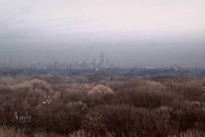
I posted my picture "Illinois #20" for sale a couple of days ago (it's been selling like hotcakes*), and my e-friend Stephen Best of Macquarie Editions wrote from Australia to say he found it too "bleak," asking me if I wanted him to have a go at it. I happen to really like the print a lot—I'm sort of besotted with it right now, actually, in the way you get about the things that come along occasionally to "nourish your enthusiasm" (Ansel Adams's phrase). I keep wandering over to look at it. And one thing I like about it is its bleakness and apparent emptiness. But I'm never averse to learning—especially from people who know what they're doing—so I took Stephen up on his offer.
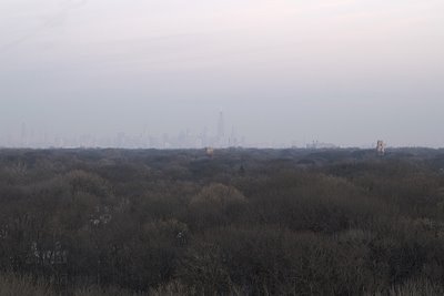
Here's what he came up with. He was working just with my posted JPEG, and he was also influenced somewhat by my interpretation, which of course he'd already seen. So it's possible—likely, even—that he would come up with something different if he were to start from the RAW file with no guidance from me and only his own taste to satisfy.
Stephen basically converted to LAB color and ran the procedure that Dan Margulis recommends in the first chapter of his new book on the subject
So what do you think? Here's what I think, provisionally: I think my version preserves the look and intensity of the light a little better—it was near dark and the light was murky—but Stephen's is actually more accurate in terms of color as I remember it. The sunset, behind hazy clouds, was behind my right shoulder, and you can see that in Stephen's interpretation.
So why "provisionally"? For the same reason that you only know what you think provisionally—I haven't seen prints side-by-side yet (and neither have you). To really decide, I'd have to try to replicate his effects on the RAW file and reprint it to his vision of it, and then live with the two for a bit.
There are two very basic lessons of post-processing that cannot be stressed enough: First, in interpreting a photograph as a print there is only bleh, fair, fine, better, better, better, and different: there's no best. (You can quote me on that. Please.) The interpretation an expert settles on will likely be better than the best interpretation a neophyte can come up with, but half a dozen experienced photographer/printmakers could conceivably come up with half a dozen different versions of the same file; it depends on how you think the particular picture works best, how you want it to communicate, and what aspects of it you like and wants to bring out. The second lesson is: You have to see it. Never skip the looking stage of the process. I think I like my version better than Stephen's, and I'll bet he believes the same thing in reverse. But unless and until we each actually see prints side-by-side, final judgment has to be reserved.
Posted by: MIKE JOHNSTON with STEPHEN BEST
*Have you ever bought a hotcake? Well me neither.**
**See William's comment and my response.
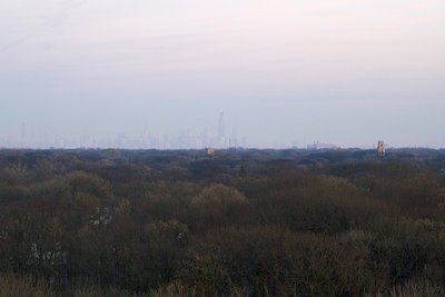
Featured Comment by advman: Sorry Mike, I couldn't resist. Here is a version I just did. You may hate it, it is almost certainly not what you've seen, but that's what I think would sell.
I made this with Lab as well, only not so decent, and added three curves adjustment layers to adjust contrast differently for the forest, the city, and finally the top of the sky.
I have no idea how bad the effect on noise would be. That is always the problem with so drastic contrast adjustments, but you might well get away with it. It is only crucial that you don't use any noise reduction on the forest. Micro-detail in the forest and noise reduction, they don't go well with each other.


0 comments:
Post a Comment